Friday 21 November 2008

Blythe House - V&A Archives


I visited Blythe House in Kensington Olympia where the V&A archives are kept, as well as items from the British Museum and also the Science Museum. I was shown the Art and Design section in which there were books and books of fabric samples, fashion forecasting books, photos, drawings etc. There were samples dating back to the 20's, however the ones that most interested me where the French fashion forecasting books from the 60's and 70's. Each page was beautifully illustrated, coloured, and full of detail. The illustrations helped to tell a story and describe the fabric sample that accompanied it. Although they were very retro looking they wouldn't have looked out of place in modern fashion illustration books. I was given a handout that explains the history behind the fashion forecasting company 'Presage'. "Presage is a highly professional fashion service which accurately forecasts fashion trends 20 months in advance. It was established in Paris in 1961. Presage is a comprehensive guide and working tool for all the fashion-related industries. Presage's presentation is never incidental. It is carefully studied for meaning and direction. This is achieved by the choice of both the quality and colour of the paper in its books, the ink used in printing, as well as the trends shown in the designs and their backgrounds. the most important advance colour is chosen for the various book covers, which change every season."

Saturday 15 November 2008

Fashion v Sport @ The V&A


This new exhibition explores and examines the fusion between contemporary fashion and global sportswear brands and their inspiration with all things street style.  There is a collection of over 60 outfits from a wide range of designers who have playfully and creatively incorporated high-end fashion into sportswear.  There is a strong focus on customization, trying to break and blur the boundaries between what is classed as traditional sportswear and fashion wear, and where these different categories begin and end.  As well as work by fashion designers such as Stella McCartney, who have designed sportswear ranges, there are also examples of how sportswear has influenced Japanese high-end fashion designers.  

The two areas looked at in the exhibition - fashion wear and sportswear do have different philosophies behind them.  Where as sportswear is mostly designed to allow the body to move, and be at its fastest and most able, fashion can sometimes be restrictive.  This can be shown in a very obvious example that athletes would choose to wear flat trainers over high heeled shoes, but I think what the exhibition is trying to show is that the trainers need not be any less stylish then shoes you would find in a fashion boutique.  As well as just the aesthetics of the clothing, technology is a key aspect and as the V&A explains, 'function and high performance are of primary concern in the design of sportswear'.  Whilst some fashion garments may be tight, uncomfortable, slow you down etc, in sportswear the priority is on producing performance-enhancing garments and footwear that coincides with the way your body works.  Traditionally sportswear tends to be streamline, and follows the natural curves and shapes of the human body.  In contrast fashion is all about concealing, revealing, distorting and exploring how new shapes can be explored in place of the standard human form.  Whereas high fashion may only relate and be available to a selected group of people i.e. in terms of wealth, gender, age, body type and shape, sportswear is much more universally affordable.  It is comfortable, not as pretentious, cheaper, and doesn't require you to look like a supermodel to pull it off.   

'The democratisation of beauty' (text reference Susie Orbach) - 
The idea of beauty expanded, broader definitions of how women's physical beauty is visually represented.  'In attempting to democratize and make accessible to all the idea of beauty, women are eager to see a redefinition and expansion of the ideals, along the lines they see it and away from the limiting, narrowed and restricted body shapes and sizes we see in moving images and print'. - from Dove beauty report.  

In a way body shape is a form of production in what is classed as the 'ideal' body shape.  This is represented in different ways due to gender, culture and general beliefs.  However with the influence of high fashion and the media in my generation we are surrounded by images of the 'ideal' female form being tall, thin, curves in the right places and generally glossy and perfect.  With the 'ideal' form being projected onto us on a daily basis it is difficult to start to consider if any other shape is acceptable.  However, depending on how easily influenced you are this determines how much these ideals will affect you.  

Fashion affects the female silhouette in different ways; on one hand you can look at it again with the idea of the 'ideal' female form and this image we all dream to achieve.  But, on the other hand, fashion is not just form those with model figures, and the catwalk is just a starting point for how fashion is gradually distilled down to us, the general public.  A huge part of fashion is also about playfully distorting the female silhouette, shoes to make us taller, belts to make us appear thinner, trousers to make our legs longer, shoulder pads to make us broader.  This is one of the few ways left that designers rely on to still keep fashion fresh and new, mixing up the traditional shapes and proportions.  In addition for the average female figure, these manipulations of the female form created by fashion help to highlight the best parts of our bodies, and hide the worst.  

Sportswear affects the female silhouette in a different way - for example the 'ideal' body type here is more toned, not as thin, strong and powerful as opposed to fashion's waif like appearance.  Sportswear tends to be more streamline and follow the natural shape of the form.  Excess fabric and weight are only going to slow you down, and comfort is key.  It is also about protection - from dangerous sports, weather conditions, or anything that could potentially harm you.  Sportswear needs to be able to work in a variety of different situations, and tends to not be designed for one particular area exclusively.  

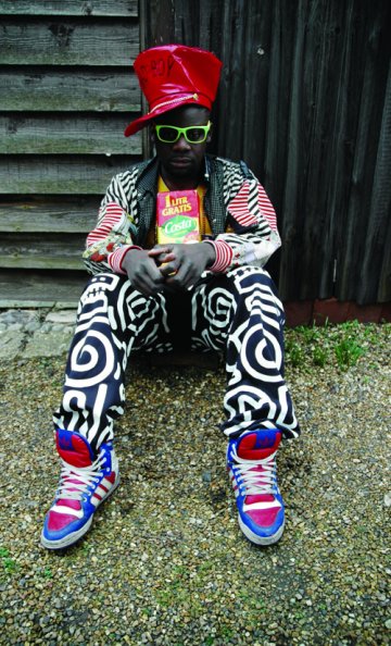
Customisation was a key aspect to the exhibition, which allows individuality to be expressed through subtle differences and modifications.  Homemade street adaptations - such as how laces are tied and adorned, or how tracksuits are worn - have inspired designers to reinterpret trainers and the tracksuit.  As well as the shapes and styles being reformed and reinterpreted, pattern and colour is exaggerated in a highly playful way.  Cultural influences are shown through this new era of sportswear, for example merging the idea of Native American moccasins with modern sneakers.  There is nothing too serious about this new style of sportswear, it is fun, bright, individual, witty and ironic.  

Sunday 9 November 2008

Cildo Meireles @ Tate Modern

This exhibition was quite different to others I have seen recently, as it was mainly installations most of which were interactive and allowed you to get involved. They were large and made a big impact when you saw them in the different rooms. You didn't quite know what each was about until you walked into it/experienced it hands on and read a little about the meaning and purpose behind each. The work was inspiring, refreshing and thought provoking. It was the sort of exhibition that you do not forget, and that I would go to see again. It is also the sort of exhibition where it is not necessary to know lots of information about the artist and his life. The small explanations about each piece of work are helpful to give you a brief understanding about the reasoning behind them, but even if you didn't read these the pieces would still be impressive and enjoyable to experience. However, now I have visited the exhibition and been part of his works I would definitely like to find out more information about the artist and his ideas.

The works were displayed in a different way to an exhibition like Francis Bacon, because the type of work is different. Rather than displaying small (or even fairly large) paintings, the installations took up a whole room sp
ace, as they were extremely large. You also had to queue up to get into certain rooms, as they had restrictions on how many people were allowed in. This added to the anticipation of what was in the room and what you were going to experience. Unlike most exhibitions where you are not allowed to touch anything, this was extremely different, especially in the final room where you entered a dark room and walked barefoot in talcon powder. Even though there are limits to how much you can touch the pieces, they are not treated as preciously as others works are at galleries. The display of this exhibition is however similar to Roger Hiorns Seizure in that you are encouraged to get involved rather than view if from afar.


This installation is called Red Shift and is comprised of a large room filled with red things everywhere, from the contents inside the fridge to the clothes in the wardrobe. It is a very strange feeling inside the room, slightly spooky, and you can imagine going mad if you had to be in there for a long space of time. Meireles describes the initial concept for the work as imagining 'a place in which someone, for some reason - whether due to preference, mania, imposition or circumstance - would accumulate in a given place the greatest possible number of objects in different shades of red'. Within the second part of the work is a tiny bottle that has spilled its red liquid contents, which leads into the darkened space of the third part of the work - a wonky red stained sink floating in space. There is red liquid running from the tap giving a very spooky vibe. According to the information given at the exhibition the title 'Red Shift' refers to a cosmological phenomenon: light that travels to Earth from distant galaxies gets stretched because the space that it passes through is expanding, a process that is believed to have started with the Big Bang.

My favourite work that I saw was titled Fontes and was comprised of 6,000 rulers, 1,000 clocks and 500,000 vinyl numbers. It demonstrates the aesthetic of accumulation which is a feature of many of Meirele's installations. Along the outside of the room where the installation is situated is a wall of clocks displaying different times, and these carry on along the walls in the room of the main work. There are numbers scattered along the floor, that appear to be fallen off of the clocks, and the whole experience is very surreal. Once you enter the room there are rulers that are hanging from the ceiling, creating a maze with a small passageway you can walk into, but this gets smaller and smaller leading you nowhere and surrounded by rulers flailing everywhere. In addition to the maze like intense experience that is provided by the physical elements of the room, there is also a soundtrack of different clocks ticking in different rhythms. According to the Tate booklet information this is the explanation to this piece of work ' The structure of 'Fontes' follows the spiral formation of the Milky Way, with the centre of the work most closely hung with rulers, decreasing in density towards the edges. Like the giant cellophane ball in 'Through', the spiral embodies the infinite, the phenomena of time and space that mankind attempts to limit or measure using the very systems that Meireles subverts in 'Fontes'. In my opinion the definitions of Meireles works are a little long winded and complex, but you don't have to be educated in the meanings to have your own experience within the exhibition.

Some other interesting information I found about the artist that explain in more understandable terms what he work is about : 'The Brazilian artist is famed for his mysterious, large-scale works...he is widely recognised for one of the leaders in the international development of Conceptional art. He has been creating sculptures and installations since the 1960's. With a fascination for scale, his work ranges from tiny single objects that could fit onto a fingertip, to huge installations filling gallery spaces. Meireles's installations are often composed of familiar everyday objects, arranged in a suprising or unexpected way. His work is engaging and challenging, drawing the viewer in.'


Wednesday 5 November 2008

Sir John Soane's Museum

I didn't really know what to expect of the Sir John Soane's museum and after visiting it I still don't really know what to think of it. I liked the quirkiness of it being tucked away and having to discover where it was, and the feeling of entering someone's house and exploring their belongings. However, I found it a little dark, with a lack of information, and none of the objects really grabbed my attention, even though I can understand the importance and beauty of them.

The display is completely different from a gallery like the Tate, as within this museum it is hard to tell where the objects start and end. Some of the objects continue up the walls and onto the ceiling, and the decoration seems to all blend in. There are bookcases filled with old books amongst objects on display, and it is difficult to verify which items are more precious than others. The lighting is quite dark which in a way feels like you are stepping back in time and into John Soane's lifetime, however the further down in the house you went the darker it was, and actually quite hard to see things in detail. In a way the museum is more similar to Roger Hiorn's Seizure, as it is more about looking at the house as a whole rather than focusing on selected items on a wall like in Francis Bacon. Labelling was sparse, I couldn't make much sense of why certain things were labelled and other wern't, but if there had been more information like in the British museum I probably would have stayed longer and been more interested. The labels were hand written, which gave the sense the objects were part of a personal collection rather than plonked in a large museum. The purpose of the museum is to get a sense of who Sir John Soane's was, and as the website explains he set it up so that 'amateurs and students' in architecture, painting and sculpture could visit his house after lectures, allowing them easy access to his wonders.


In 1806 Soane began to arrange his collection so his students could begin to visit his house and his objects. In 1833 Soane negotiated an Act of Parliament to preserve the house and collection for benefit of visitors and students, and on his death in 1837 this act came into place. Since his death, each successive curator has tried their utmost to maintain Soane's arrangements and wishes.

From visiting the website, you can see that the museum is about history and telling a story. There is a link to the National Portrait Gallery to see images of Soane, and start to learn about who he was and what he did. You start to understand the context of the museum and the collections. The objects are listed, with no images, and there are larger descriptions of some particular items. As for other advertising, the museum is signposted from Holborn station, but rather discreetly.

The objects housed within the museum are all along the theme of architecture, painting and sculpture, although you could argue the house and its decoration itself are part of the collection. There were cases and cases of books, old clocks, sculptures mounting the walls and ceilings, paintings and portraits, tiles, furniture, stained glass, casts. The objects ranged vastly in where they originated from and in what time era for example Ancient Egyptian, Medieval, Renaissance, Oriental, Classical etc.

The display of the museum was in terms of room within the house. The objects were not clearly categorised like in other museums, however there were grouping of sculptures, tiles, paintings etc. I found the groupings to be quite random, but this may have been because of my lack of knowledge of the history. Unlike other museums were things are neatly displayed in casings, the items grow from the walls high up onto the ceiling. You have to keep looking around you to fully explore the collections. Some items are in glass cases, but there isn't much logic to why they are rather than others. The collection seems to have the same amount of value the way they have been displayed. The objects do flow in the way they have been displayed but it is certainly not as clear as other museums. Perhaps this is an advantage, however I would have appreciated more information.

Only selected objects have labels, which made me think perhaps these were more important and precious than others. The labelling seemed to be quite random, with hand-written brief descriptions simply displaying where the item was from and what era. There was little information about who made the item, the context and reason behind it, what it was doing before Soane collected it. It was a bit of a mystery as to what each object was about.

There was some information about how Soane acquired certain objects, such as the Astronomical clock, which explains it was bought after the death of the Duke of York (1827). However, I would have appreciated more of this type of information to understand how these objects landed in London. It is clear that Soane owns the objects, but did he get given them/buy them/in what country/from who? The website does explain this a little better, but as it has no pictures of the items it is hard to piece the two things together.

We can assume that Soane didn't make the objects as the old sculptures and Egyptian antiques are obviously before his time, but it would have been useful to find out more information about who actually did make the objects and why. However, again once you look on the website it does have descriptions of where the items were made etc. The context in which some of the objects would normally be seen and used is obviously very different to how they are displayed, for example the Egyptian items. However in the Painting room, it is far more understandable to see old paintings displayed like they would have been in an old home as apposed to a stark white modern museum.

Overall, I left the museum feeling a little confused. I would have appreciated more information about the collections, however I can understand and see why there was a lack of labelling. It is a different experience to going somewhere like the British museum, it is more of a journey and somewhere to explore for yourself. Roger Hiorn's Seizure wasn't full of labelling and information, but perhaps because I had more of a understanding about it before I went I was able to understand and appreciate it more. From an artist's point of view, the John Soane's museum is a place you can be inspired by and draw from, without worrying about the overloading information and what labels are trying to tell you, but you can interpret the items yourself.

Sunday 2 November 2008

Wednesday 29 October 2008

Friday 24 October 2008

Francis Bacon

Today I went to visit the Francis Bacon exhibition at the Tate Britain gallery. The exhibition is immediately intriguing, as the scale and colours of the paintings jump out at you and invite you inside. I love large scale work, and within this exhibition particularly it really made an impact. The works were bold, bright, strange, surreal, distinctive, some familiar and others not. They flowed well, and even though the rooms were themed, there were no huge significant jumps that caused confusion. I walked around every room at first to decide which two paintings to talk about in more detail, which I found difficult as so many of them were inspiring.

Before visiting the exhibition I had limited knowledge about Bacon and his work. I would be able to recognise them and his style, however I would f
ind it difficult to explain the context behind them. Although it is important to understand the meaning behind his works, my lack of knowledge here did not affect my experience at all. In each room there are themed descriptions, with names such as 'Animal', 'Zone', and 'Portrait', and in addition to these, some of his works have a brief explanation. However, I found that because of the surreal and bizarre elements to his work, I was happy to interpret and discover meanings myself. A review or outside information can often affect your expectations, relying you to continually contrast and compare opinions. I prefer to be blissfully ignorant and decide for myself what I think, and adapt the experience to a more personal level. Saying this, after I left the exhibition I was curious about elements and I have researched and explored his ideas now that I am familiar with his work.

The works were displayed
in 10 rooms, which each had a title and description of this theme. This allowed you to get a better understanding of those particular works. The paintings were grouped together in a comprehensive manner, and they followed a story of his life. Most of the works were fairly large in their scale, which allowed them to flow, and I found I could wander in and out of rooms without confusion to what was going on. One room shows Bacon's studio and sketchbooks, which gives an inside aspect and personal view to how he worked, giving you a sense of the painter as a person. There were rough sketches planning out his larger works that were found as he didn't want anyone to see them. I read this was because he said his images were created entirely spontaneously, and it seems he didn't want anyone to know he did actually plan his ideas. The amount of information provided is just enough, as it allows you to interpret his ideas for yourself. It invites you into the creativity and unusualness of them, and some are so bizarre that probably no one but Bacon actually knows what they convey. Unlike museum collections which have true explanations and the history behind the artifacts, the exhibition is a much more free and open minded experience.


This painting 'Triptych' - August 1972 was in the room titled Memorial. This room is dedicated to George Dyer who was Bacon's closest companion and model from the autumn of 1963. He committed suicide on 24 October 1971, two days before the opening of Bacon's major exhibition at the Grand Palais in Paris. This is one of the works Bacon made in memory on Dyer. Here is some information I found about the painting on the Tate website. 'This work is generally considered one in a series of Black Triptychs which followed the suicide of Bacon’s lover, George Dyer. Dyer appears on the left and Bacon is on the right. The central group is derived from a photograph of wrestlers by Edward Muybridge, but also suggests a more sexual encounter. The seated figures and their coupling are set against black voids and the central flurry has been seen as ‘a life-and-death struggle’. The artist’s biographer wrote: ‘What death has not already consumed seeps incontinently out of the figures as their shadows.’'

The painting is oil on canvas, the same material used for most of his works. The figures are missing pieces and
elements to them suggesting how dead and lost Bacon was feeling. The colours of the flesh are raw, like meat and open wounds. They are dripping onto the ground, washing and wilting away, decaying within the grey morbid tones. The three canvases are large, but not the largest in the room, the sizes stay pretty consistent. They are not the craziest or most colourful works in the room, but they had a real sense of sadness and emotion to them. The flesh colours really stand out amongst the background creamy colours. It looks raw, affected, and pained. There are circles of colour within that appear to be flowing patterns within the skin, the blood flowing and oozing out onto the ground, dripping away slowly.

I wouldn't have know that Bacon is portrayed in the image, unless I had read about it, and this adds an extra personal dimension to it. He is reflecting on their relationship, still painting his friend who is no longer in the world. There is meaning and depth to the work, a huge sense of sadness, lost and guilt. The fact that Bacon includes himself in his works illustrates how they are
a personal response to the world around him.

As a textile designer I look at this work in a number of different ways. First of all I am interested by the meaning and story behind the image. I like how you sense the emotion within the painting even without knowing the proper context. Secondly, the intense colours of the raw looking flesh also attracted me, as well as a number of words that came to my mind when viewing the work. Swirling, tints and tones, movement, form, dripping, flowing, sadness, dissection, missing parts, rotting, decaying, confusion, masking, hiding and reveal
ing.

The intention of this painting could have been to reference George and illustrate how the dead are still included in life, even if their physical body has been taken away. It could mean a number of things on a personal level to Bacon, however the fact he was an atheist suggests he believes the living and the dead live as one, like in the image, and there is no such thing as God or a
n afterlife.


'Figure Study I' 1945-6 Oil on canvas
This painting was in the first section of the exhibition, in the room under the title of 'Animal'. The room explains Bacon's works in the 1940's reflect his belief in, without God, humans are subject to the same natural urges of violence, lust and fear as any other animal. This painting stood out to me very strongly, and even though it was one of the first I saw I came back to it again at the end. I particularly like the mixed use of marks and colours, especially the dark coat against the tangerine orange background. There is a great deal of texture shown within the marks of the coat, and it really conveys the fabric to be a thick, woolen and wintry. The image is a very sad one, and one of contrast, beautiful blooming flowers against a collapsed individual. It appears as if the individual is mourning, and you can feel the sadness is so deep the man cannot bear to even lift his head. The more I thought and looked at the painting, it also occurred to me, that there is no evidence of any flesh or human body, and illustrates how clothing can be so suggestive and expressive in possibility.

The image is medium sized, still fairly large but not as large as some of his greater works. It fits within the room well, as the other works are of a similar size. The colours also work together as a room, however the flowers within this one and the detailing seem to bring it to life more. The works within the room flow as they all illustrate heads and figures, and are not as distorted as his later works. They do however, begin to show Bacon's anxieties and issues.

The colours within the flowers stand out strongly against the man's dark coat, and it is ironic the flowers looks so alive and vivid when the figure is so obviously in emotional pain. There are orange marks continued into the fabric of the coat, and the blue of the flowers bounces off the image when placed next to the orange backdrop. The colours are autumnal, and the thickness of the woolen looking coat suggest it is cold and bleak.

The works within the 'Animal' theme room stand alone, although the theme is similar throughout. However, this particular painting seems to be the most detailed in the room in terms of marks. Where as the others show abstraction to the faces, twisting and blurring, the man's face within this image is completely blocked with the large coat and hat. It is visible there is someone inside the coat, as the bent back deeply suggests this, but the actual flesh is masked with clothing.

I don't know who the figure is meant to represent, but perhaps it is just showing an example of our complex human emotions, how sad and alone we can feel. Death in this matter, can leave you numb and also wanted to corrode away, throwing yourself into your emotions and pain you feel.

From a textile point of view, the marks in the painting are very inspiring especially those used in the tweed material of the coat. They are built up and not overly detailed, however you can realise at one there is a bend form hiding beneath that vast material. The slouched back has been created by the dimensional lines in the coat, immediately suggesting the figure's emotional state. The colours are inspiring, bleak and dark but also bright and blooming. The marks of the petals and flowers and alive and bold in contrast to the emotion of the figure.

I think the intention of the painting is to show and explore human nature and the emotions we experience throughout our lives. The painting suggests so much is such simple ways, and you can immediately see a sense of sadness. There doesn't need to be a lengthy explanation beside it, because as a human everyone can identify with that emotion that is being portrayed. Bacon is not afraid to show this ultimate desperation and sadness and illustrates how one act of the human body can be so suggestive and powerful.

Sunday 19 October 2008

Guillermo Kuitca at Hauser & Wirth Gallery


I visited Guillermo Kuitca's work who is described as 'a painter of space, an organiser of emptiness'. The works above are the ones which I was most attracted to, the first image is of a long painting 'in which migrant splinters of a map blizzard the image, presenting a maelstrom of disconnected information'. From far away the image looks like a large photograph of split up map pieces, but when you look closely you notice it has been painstakingly painted. Even though the artist is based in Buenos Aires, the colours of the map reminded me of the tube map. The two other images are of eight digital drawings. They are 'maps and architectural plans that have been manipulated with water, dissolving their inks and displacing the details they harbour into a slew of seeping fragments'. I love the crumbling, fading and decaying appearance of these, and remind me of some of London's street art, as well as peeling away old posters scattered around the city. The artist's work fitted the modern white crisp gallery space perfectly, however if they were displayed in Fortnum and Mason for example, they would look rather displaced amongst the regal surroundings.

Cakes Cakes Cakes


I saw these impressive cakes in Fortnum and Mason in Piccadilly. They were huge, tucked away in glass cabinets, and crafted with the same fine precision that a designer dress would be. The over the top, traditional regal appearance of the cakes represent the whole aesthetic of the department store, only stocking the finest high class products. The first cake is described as being inspired by Regency, contemporary in execution, featuring a striped border using details from the store. With a price tag of £1250 it certainly wouldn't be an impulse buy. I've always loved decorative and beautifully crafted cakes, and I don't think these would look too out of place in a gallery. The way they were presented in the store, enclosed in glass boxes, is similar to how fine jewellery would be displayed in a designer boutique.

Russian Dolls


I came across these Russian dolls at the Piccadilly antiques market, a small market featuring a collection of kitsch second hand items, ornaments, and general things would find at your Grandma's house. I particularly liked the Russian dolls for a few reasons such as the array of pattern and colour, and how each one was different whether it be in size, or decoration. I like how Piccadilly features some of the most traditional buildings and shops, however there is still a huge mix of international influences seen everywhere. The Russian dolls represent how London has become what it is from its eclectic mix of other cultures and nationalities. Depending on where you go you can have a taste of classic British culture, or can equally have an experience different to anywhere else you would find in England. Although many of the items at the market looked tacky and dated, they would appear in an entirely different way if say they were featured in one of the high class antiques shops on Bond street. Equally, you could argue each doll is a piece of art work, and could make an interesting feature in a gallery, especially for anyone intrieged by textile elements of pattern and colour.

Piccadilly

Piccadilly runs from Hyde Park Corner in the West to Piccadilly Circus in the East and is within the city of Westminster. Until the 17th Century the area was known as Portugal, after Portugal street. The name of Piccadilly arises from a tailor named Robert Baker, who owned a shop in the late 16th century to the early 17th century. He earned a large fortune by making and selling piccadills - that were then in fashion. Within his wealth he bought a large area of what was then open country land and in about 1612 built a large house there, which was known as Piccadilly Hall.
Piccadilly is one of the widest and straightest streets in London, however is not as popular to shoppers as other nearby areas. There are a handful of famous shops, as well as the Ritz hotel, spectacular restaurants, offices and chic expensive flats.
Piccadilly is home to Fortnum and Mason, one of the most famous shops in the world, closely associated with the British Ro
yal family. It has an outstanding food hall, filled with both basic and exotic ingredients of the highest quality. It is regal and classic inside, and the shoppers are match the same high class as the products sold.

The Royal Academy of Arts is based in Burlington house which is as stunning as the artwork inside. It was founded by George III in 1768, and was governed by artists to 'promote the arts of design'. It has an unrivalled reputation as a venue for exhibitions of international importance.

Dover Street

Dover street is located in Mayfair and is full of Georgian architecture as well as historic London clubs and hotels. The street is full of history and a number of historical figures have been known to frequent the famous Brown's hotel such as Napoleon III, Theodore Roosevelt, Rudyard Kipling, and Agatha Christie. There are currently a number of well-known clubs including The Arts Club, founded by Charles Dickens, The Bath Club, where Mark Twain breakfasted, and Mahiki, which is often frequented by celebrities and royalty. Dover Street Market is a must see retail concept featuring avant-garde fashion, design and art objects.
An eclectic and inspiring display in Dover Street Market.

Bond Street

Bond street is known for it's array of upmarket shops, it is in the Mayfair district of London and has been a fashionable shopping street since the 18th century. In the past Bond street was best known for top end art dealers and antiques shops, scattered around the the London office of Sotheby's auction house, which has been in Bond street for over a hundred years. Nowadays there are predominately fashion boutiques, included some of the most expensive and cutting edge designers in the world. The street has a real sense of old traditional London and the buildings have a classic regal aesthetic to them. The people who visit the area are mostly wealthy and stylish shoppers, as well as many international jet setters. Since 1700 Bond street has been the home to some of the most wealthy, stylish and influential people, and remains today a hotspot for celebrities and socialites.